Brand Refresh—Four Roses
- Brand Identity
- Content Lab
- Digital Video
Distilling a historic look
Distilling a historic look
As one of America’s oldest bourbon companies, Four Roses was a legacy brand with a legacy look. They needed a new visual identity to bring them into the 21st century without jeopardizing their century-plus brand equity.
We developed a brand refresh inspired by their craftsmanship and rooted in their history—the end result: a premium, elevated design that feels like it’s always looked this way.
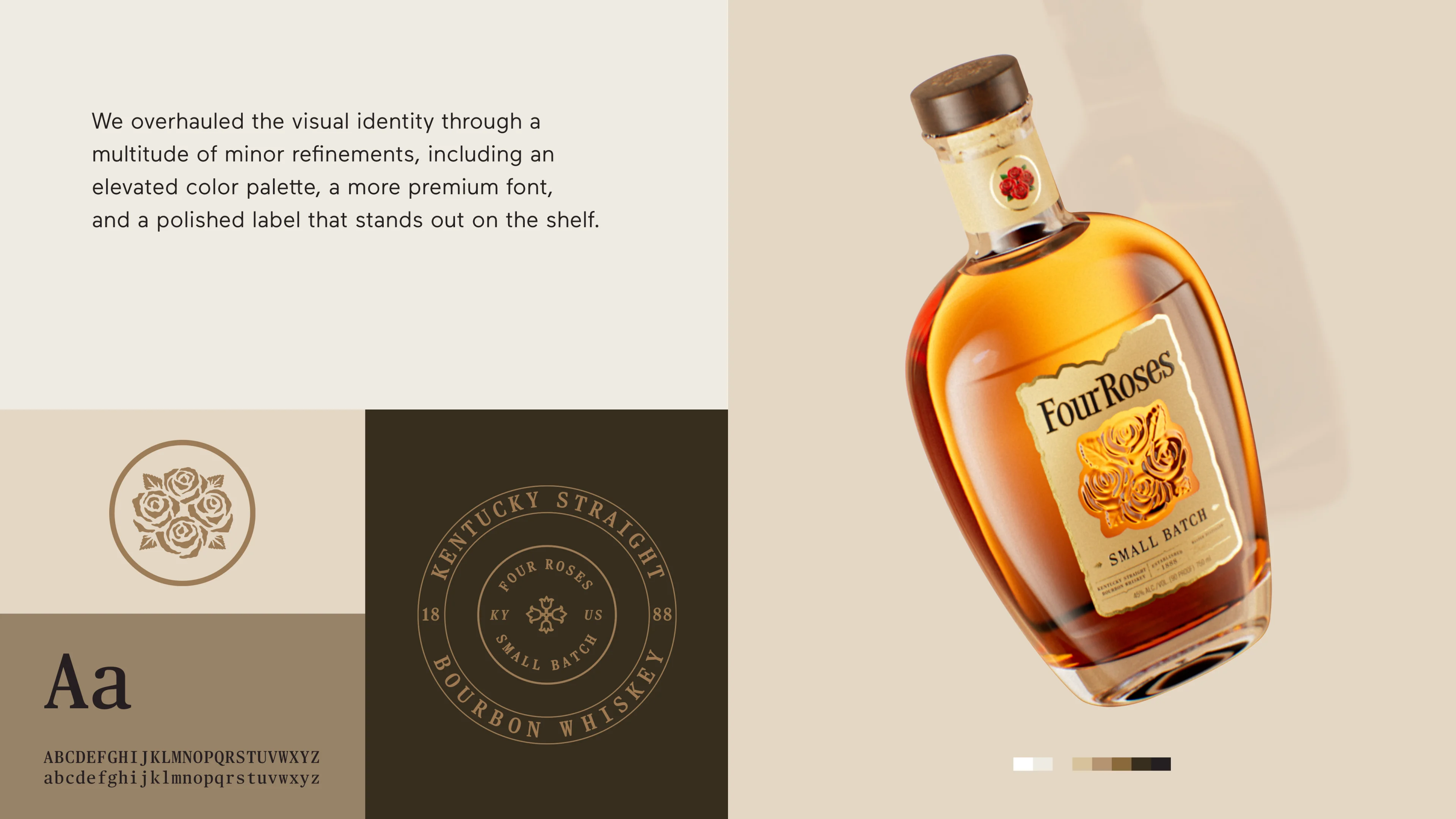
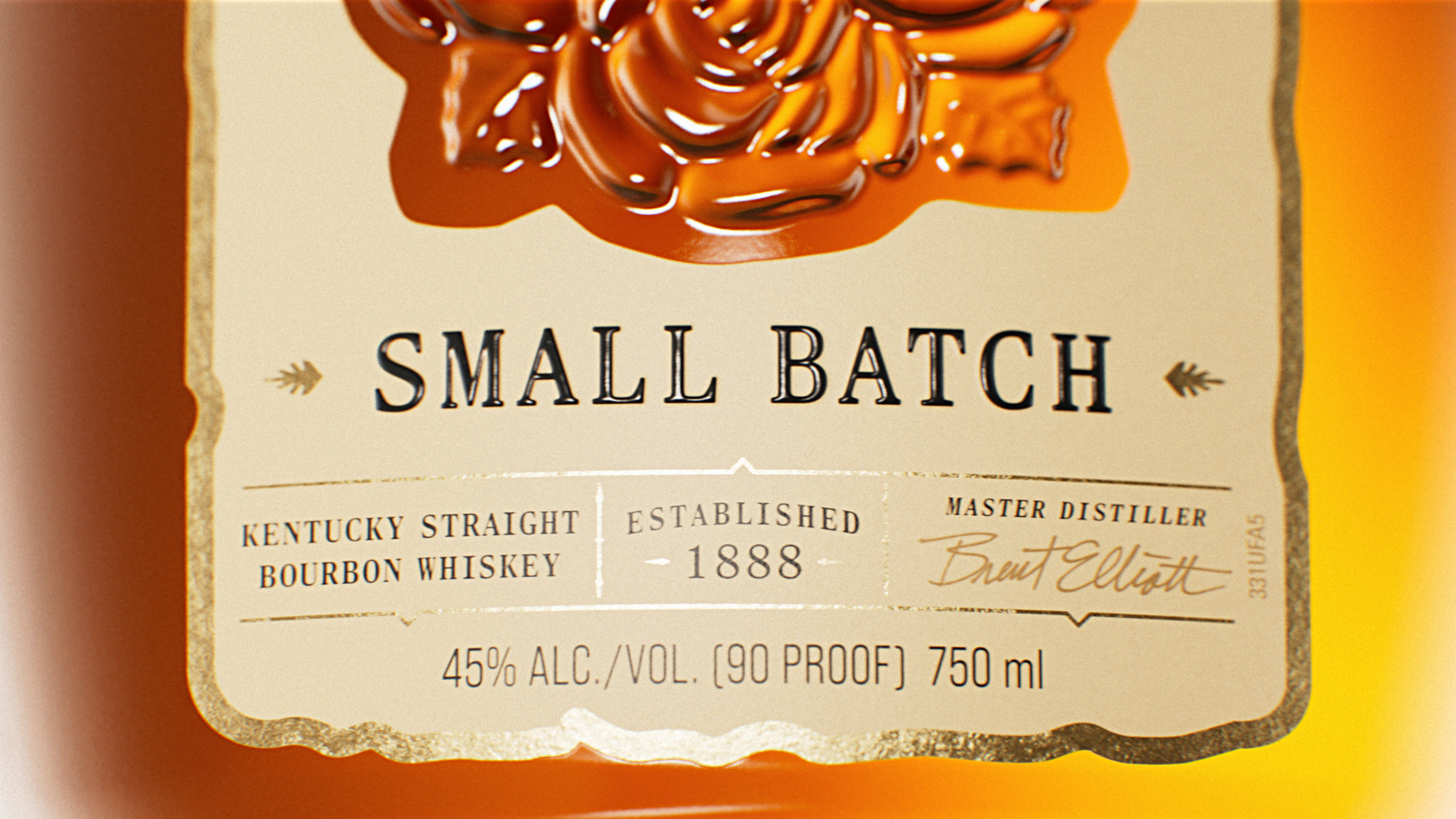
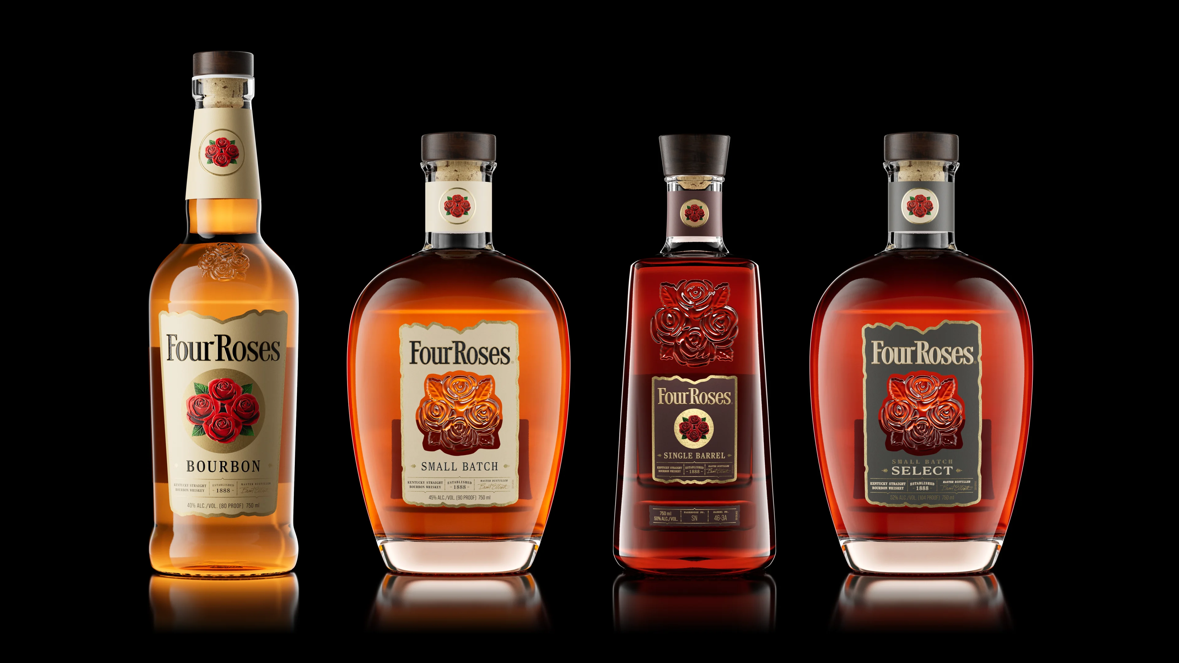
Minor changes. Major difference.